The PROBLEM
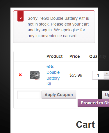
Does your WooCommerce Shopping Cart page looks like this on your mobile phone?
Many themes that are so called “Integrated with WooCoomerce” sometimes fall short of actual integration. This can lead to your shopping cart looking terrible on mobile devices. Imagine you finally get a site visitor to the point of sale and they back out because your shopping cart page looks like this.
The issue here is that the product thumbnail is taking up to much space for the rest of the text to align correctly on mobile phones. Also the “Proceed to Check Out”, “Update Cart” and “Quantity” buttons are out of alignment along with some of the related text.
The best solution for this is to use @media CSS to make the alignment changes on screens 479px and smaller.
The SOLUTION
Just add the following lines of CSS code (Without the numbered lines to the left) to the bottom of your themes custom CSS style sheet.(You should be using a Child Theme) Be Careful Wen Editing CSS or Any Other Code. If You Are Unsure About What You’re Doing, Contact an Expert.
@media only screen and ( max-width: 479px ) {
.short-description, .product_meta, body.woocommerce div.product .woocommerce-tabs, body.woocommerce #content div.product .woocommerce-tabs { display: none; }
body.woocommerce .images { float: none !important; width: auto !important; margin-bottom: 40px !important; clear: both !important; }
table .product-thumbnail { display: none; }
.woocommerce-page #content div.product form.cart .variations { margin-left: 0; }
table.cart th, #content table.cart th, table.cart td, #content table.cart td, table.cart tr, #content table.cart tr, #content-area table tr, #content-area table td, #content-area table th { padding: .857em 0.287em; }
.woocommerce .woocommerce .col2-set .col-1, .woocommerce-page .col2-set .col-1, .woocommerce .col2-set .col-2, .woocommerce-page .col2-set .col-2 { width: 100% !important; }
.woocommerce .woocommerce form .form-row, .woocommerce-page form .form-row { width: auto !important; float: none !important; }
#order_review .shop_table { margin-left: 0; }
}
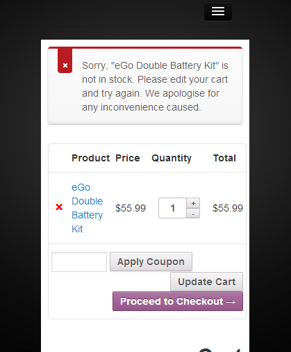
The RESULT
The result is a beautiful and more importantly correctly aligned WooCommerce Mobile Cart and Checkout Page.
If you found this information useful, please consider sharing it using any of the over 300 social platforms below.
Recent Comments